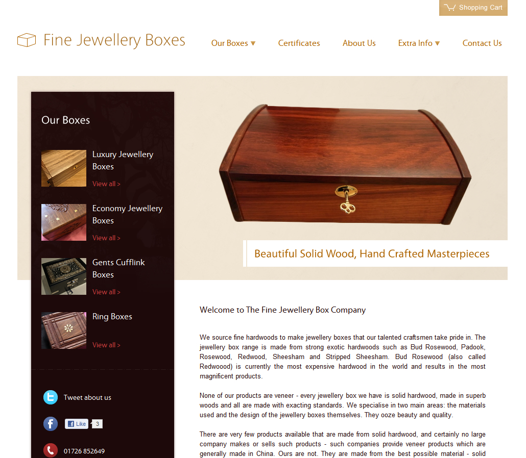
The Fine Jewellery Boxes website was redesign completely, scrapping the old generic design and replacing it with a modern boutique feel. I was given complete freedom and worked over several design variations before finding the perfect match for the beautiful hand crafted jewellery boxes.

When I was approached to craft a mobile website for cars 4 rental, I knew this was the perfect opportunity to re-imagine the experience. In a single responsive website which works flawlessly on any device. The new experience, a single bold image with a bright orange colour scheme and a focus on exploration.
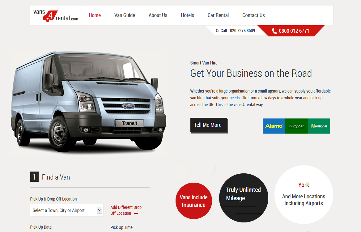
Refinement. This website is completely centred on the essential information and function of finding a van to hire. It was refined over and over until it reached its inevitable and beautiful conclusion. Not forgetting the little tricks to reduce clutter along the way keeping vital information only a click away.
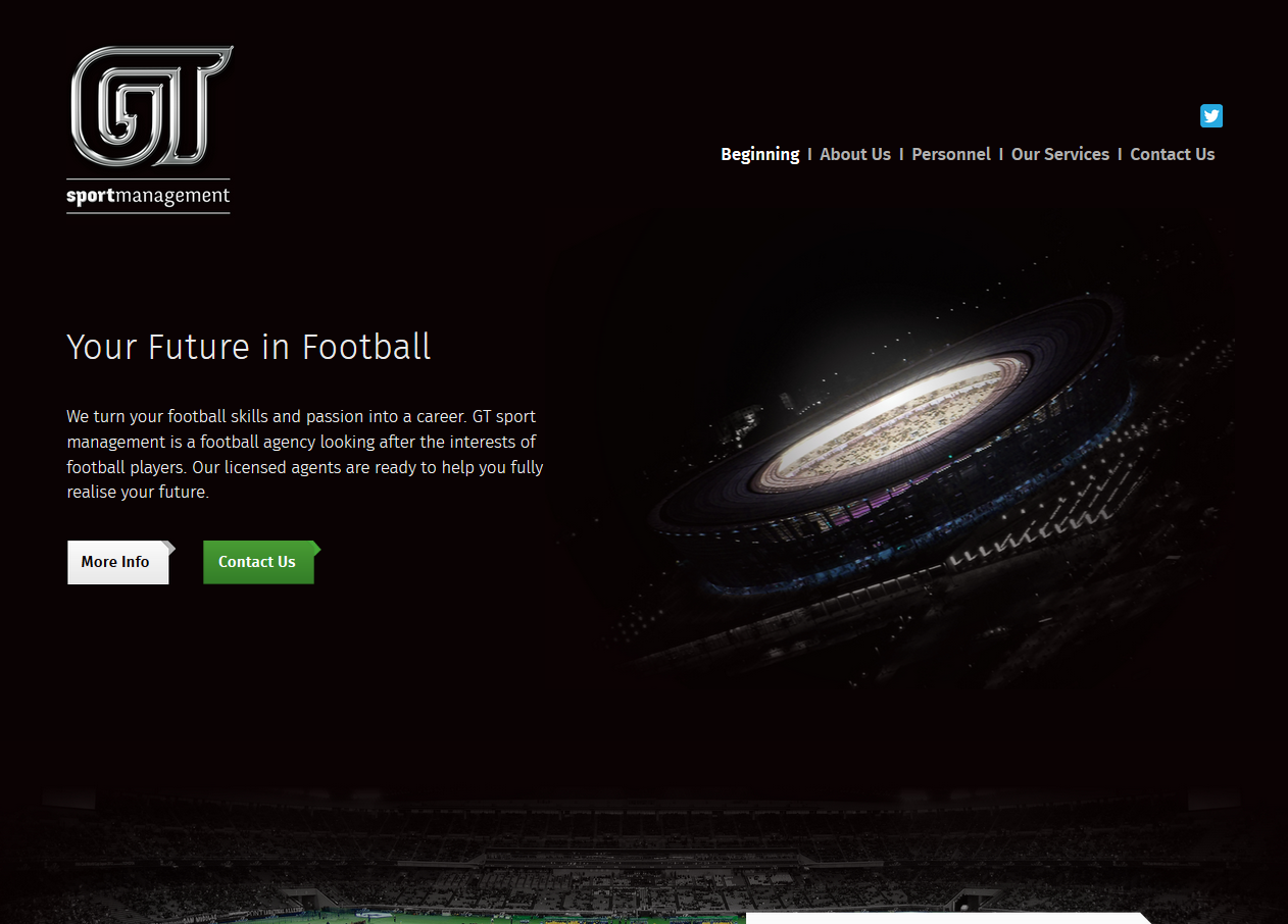
With the sole aim of providing services to future football stars it became apparent exactly which direction to take the website. I focused on fostering the excitement of the game, thrill of playing in a stadium full of cheering fans. Set within a minimal and magical one page layout.

Taylor Made Conservatories were seeking out a high quality website. I think this design really delivers. Working with Woodgate Computers I was tasked with picking up where the previous designer left off. I reused some elements favoured by Taylor Made as a basis to build something much more elegant.

Water management specialists and consultants, Aqua Veritas work with some of largest corporations in the UK and Europe. I joined forces with their in-house team of designers to construct a new website to a strict set of guidelines. Despite a short time frame, the result was a great collaboration.

Building an entire identity for a new company is always a challenge. I tried to create something that truly added value to the company. A unique design which will stand the test of time, incorporating spots of very smart technology. It is unlike any window cleaning website you’ve seen before.

An intriguing project was brought to me in the shape of an italian radio/podcast show that was in real need of a website redesign. I created multiple concepts for the founders before the bold yellow and black scheme was selected, utilising fun interactive elements to engage with visitors.
Show Off Air
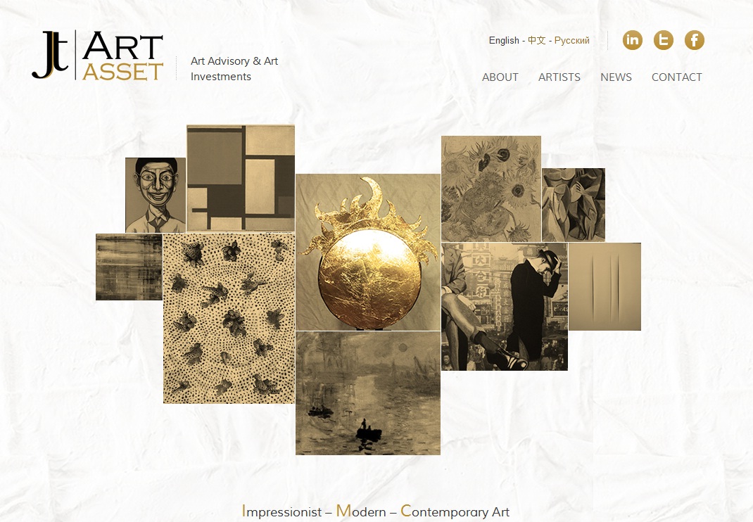
This design is deceptively simple. It features an animated front page of fading famous artworks tinted in gold. This was very much a collaborative work with the director of the company Daniel. The intention was to find design harmony with the provided logo and background. The look was carefully refined over time.

The British West Indian Institute is an organisation that seeks to “educate, enlighten and entertain visitors”. With that in mind I tried to build something that would be a joy to use, yet retain the educational nature of the institute. This design balances both, with the bonus of a rich Caribbean theme throughout.
Website Changed
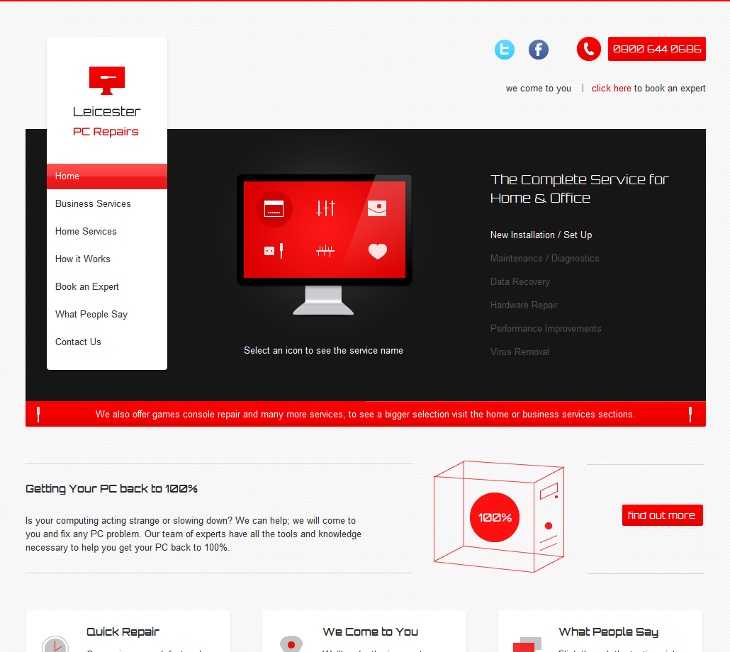
Leicester PC Repairs was a design that evolved over time. It was carefully crafted to suit the focus of the company. It contains the added elements of interactivity to engage visitors in a new way which is complemented with the social media options to communicate via Twitter or Facebook.
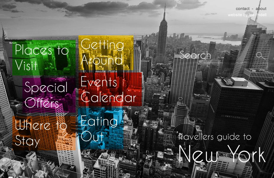
Another example of concept work, it’s the online guide to New York. The design is a break from the usual navigation you find on websites with big bright image links transparent over an image of New York. The six hubs are designed to ensure it’s easy and fun to discover more information for a trip.
Concept Work